AVENUE
100% DEVELOPMENT SALES


How a virtual concierge sold out Miami’s toughest real estate market
Avenue. Just another condo in Miami? Well it could have been, but when the developers of the new high rise going up on Brickell told us they needed something fresh in a cloudy market, we did the homework and discovered that the Brickell area was a very tough sell. It was clear from the start, the people of Miami did not know how to live ‘in town’. This was a commuting culture. Walk to dinner? Walk to work, how could this be? Who will guide us in this new urban lifestyle?
Almost nobody says they love commuting. We heard stories and nightmares about the South Florida ‘drive-time.’ Avenue offered a simple fix. Yet people resisted at first, not seeing this as a reality, wondering, but how would I… Enter Julie Anne to make it all clear. And it worked.
The campaign trusted the new urban dweller would not have a clue about in-town living. Based on that truth we could have run ads forever preaching this concept. There are just so many things a commuter culture doesn’t understand about urban living. It’s almost too easy, almost.
Have you noticed we hardly mention the development itself? Why waste the energy and money, in this market- A great building is like expecting 4 tires on a new car. Don’t worry we had all of the usual suspects, the VR renderings and tours, floorpans galore and heroic architecture imagery.
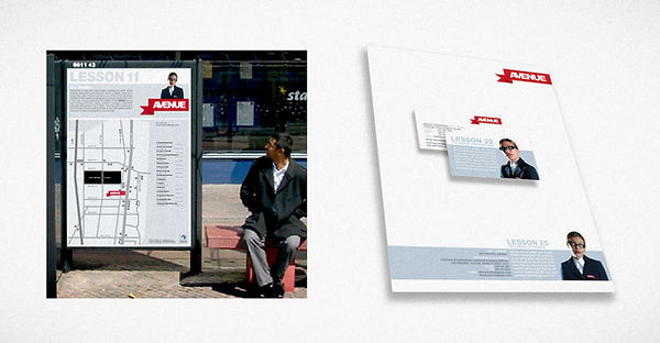
I created Julie Anne - a virtual in-city living concierge. We let her be the agent in charge to guide buyers and gracefully hold their hands through the idea of falling out of bed right into your office. Her retro jetset vibe caught the eye of the demography we targeted as the professionals that would be open to this new living arrangement. And they came in droves to live at Avenue. In-Town Miami living was never the same.
Strategic Leadership + Hands-On Execution: Led brand development and campaign strategy. Co-designed all marketing materials. Created "Julie Anne" character system, and directed all lifestyle photography. Designed Julie-based interactive website.